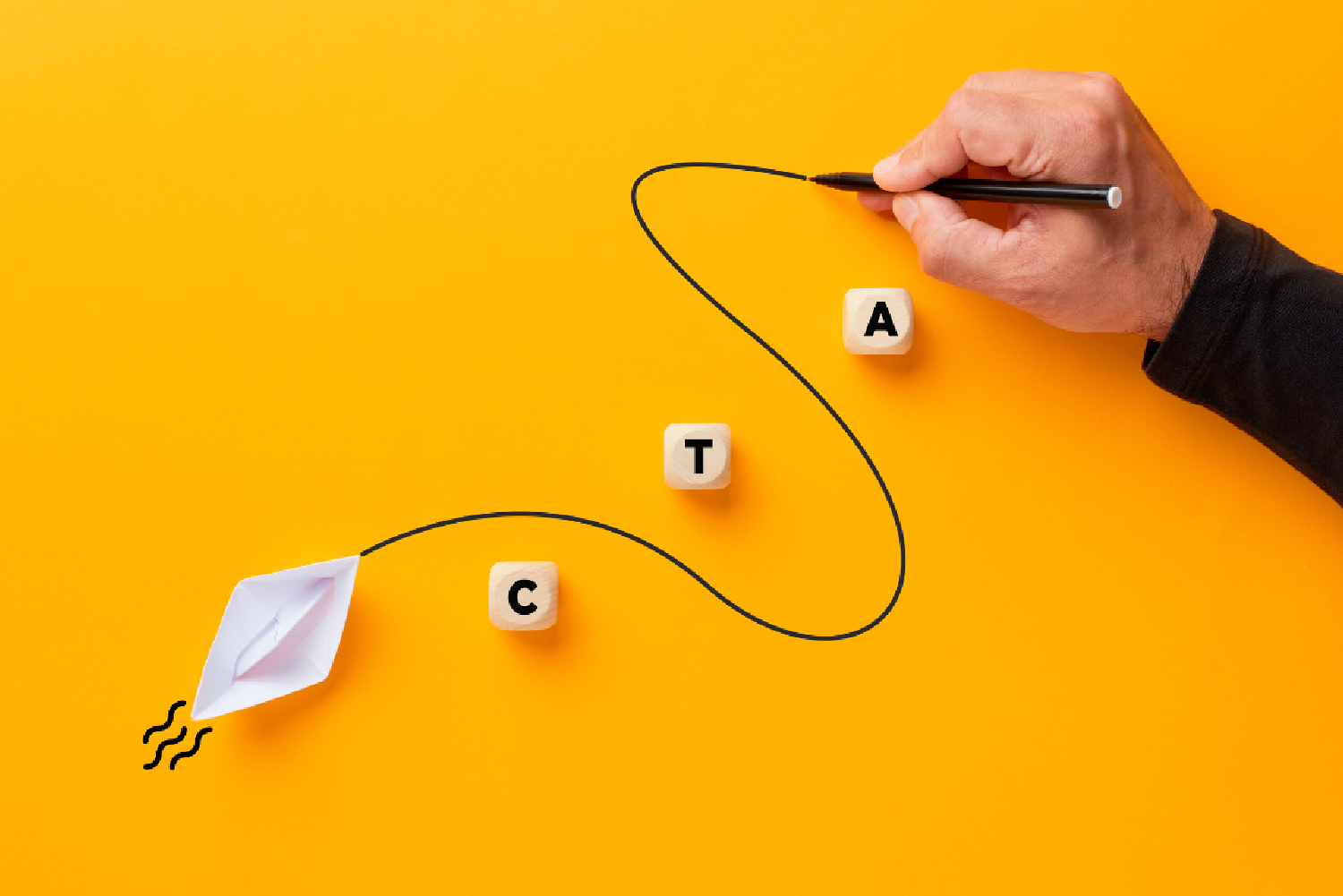
Convert a Browser into Buyer with these top CTA Tips!
Call to action buttons (CTA’s) are incredibly powerful tools that you can use on your website to massively boost your conversion rates. But there is a right way and a wrong way to implement a CTA and in this piece we're going to dive into what makes an irresistible CTA that prompts your ideal customer into taking an action.
What a CTA is, and what it is not
You shouldn't confine your definition of a CTA to simply a button or a link, instead think of it as a prompt or a nudge to make a prospect actually take affirmative action. That action could be a range of different things from enquiring further about your product or service, right up to actually clicking the ‘buy’ button.
Words are very powerful here, choose the right ones and you can convert a browser into a buyer through emotions and reasoning. Choose the wrong words and your CTA will simply be ignored. The difference between “Purchase here" and “Secure An Exclusive Price Now" can be very powerful, as emotions can make potential buyers feel like they can’t miss out on something. This sense of urgency is used very effectively by many successful retailers.
What an effective CTA looks like
The design of your CTA’s are really important. Try to get your CTA to pop off the page using contrasting colours, varying sizes and impactful shapes to draw attention and insight a browser to click. Location is equally important too, and where possible, you should place your CTAs above the fold; that is in the top half of the screen where a visitor lands on a page. It needs to be placed prominently to make it appear important.
Make your CTA’s personal
Try to speak directly to your ideal customer by using CTAs that incorporate user data. When a customer logs in, greet them with their name. Suggest products and services based on their previous purchases or interactions with your content. You can utilise incremental testing here to find out what really works with your audience.
Don’t forget mobile!
With more than 50% of traffic now coming from mobile devices in 2024, your CTAs must be just as effective on a small screen as they are on a desktop. Stay ahead of the curve by tracking new technologies and behaviours
CTA Mistakes to Avoid
We're making a case here of how powerful CTAs are, but don't overuse them as this has a tendency to overwhelm users to the point where they can do more harm than good. Be clear in your messaging and try to imagine viewing your site through their eyes. You are trying to help users, not confuse them. Don’t be too blunt either, if you have a CTA that states ‘only a fool would miss this deal’ then you’ll just alienate your audience.
CTA FAQs
What makes a CTA irresistible?
A truly irresistible CTA combines compelling language, great design, strategic placement, with a clear value proposition that generates a sense of urgency and exclusivity.
How should I test CTAs?
Test whenever you make major changes to your site or marketing strategies. Test regularly but only do so when you have enough data generated to yield valuable results.
Can I overuse CTAs?
Yes you certainly can! CTAs that are in your face all the time can invoke a negative response from your audience. State the case for your product using urgency, but highlight the value, rather than the missed opportunity.
Does it matter what my CTA's look like?
Yes it does! Colours can help generate different emotions. Red can give a sense of urgency, while blue can imbue a sense of trust and security.
How do I know if my CTAs are working?
Measure your CTAs by tracking your click-through rates (CTR) with software. Look at conversion rates, and the overall performance. Remember you are targeting those that go on to take meaningful action.
